Case study
Vibee onboarding case study
Product Designer · Popcorn AI Tech Inc.
Vibee is a community app built around photos and their AI-interpreted mood. I proposed and created an onboarding flow that introduces the service and lets people explore a group before choosing to share a photo.
The finished experience
See the group. Choose when to share.
Vibee is a community app built around photos and their AI-interpreted mood. I proposed and created an onboarding flow that introduces the service and lets people explore a group before choosing to share a photo.
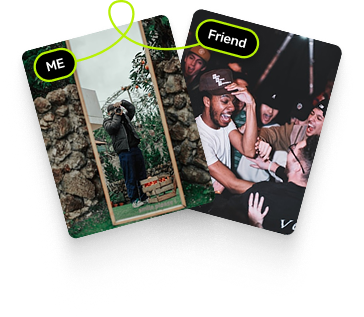
I proposed the flow and made it tangible.
At Popcorn AI Tech Inc., I proposed the onboarding sequence and splash, then created the UI, interactive motion and microinteractions. The work connects the order of requests with the screens and feedback that carry them.
Where people hesitated
A photo stood between sign-up and the group.
The earlier flow asked for phone verification, profile and social details, then a required photo. People had to contribute before seeing the group. There was no introduction to explain the experience they were about to enter.
What are we asking people to do first?
Walking through onboarding revealed a required photo before any introduction or view of the group. The steps also lacked clear feedback. I proposed giving people context first and making progress easier to follow through the UI.
Launch readiness left the first visit unfinished.
The team was focused on moving quickly toward launch. Walking through onboarding exposed missing context before the photo request and little feedback between steps. I proposed improving the first-use flow through its sequence, introduction and motion.
One request, four points of friction.
The photo request arrived before an introduction or a view of the group. It was mandatory, while progress and completion were hard to read. These were the parts of the entry experience I could address through flow and UI design.
Evidence and priorities
Find where the first experience breaks down.
Interviews and usability testing involved 14 internal and prospective users. Questions and hesitation around the early photo request helped locate the problem. The original case also reports 30–40% photo-step abandonment; its sample is unspecified, so it remains a reference figure.
Make room to understand before asking for a contribution.
I focused on the first visit: explain what happens in Vibee, let people see the group, then offer photo sharing. Deeper engagement remained a later priority. This kept the work centered on the point where people were being asked to begin.
Rebuild the path
The group comes before the photo request.
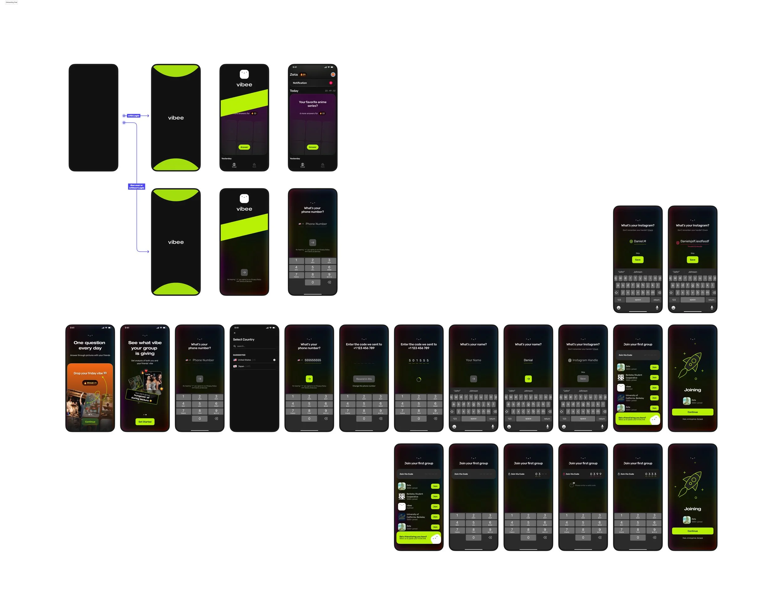
I moved photo sharing after group browsing and made it optional. A splash and two introduction screens now precede phone verification. Account setup leads into the group, giving people something to explore before they decide to contribute.
Reduce what is required to get started.
I removed gender selection and kept account input and verification. A photo became a choice after browsing. This opens the group without requiring an immediate contribution; reaching the group and choosing to share are now separate moments to evaluate.
Carry the new sequence through the whole flow.
The screen map connects the introduction, authentication, profile and group entry. It also covers returning users and different ways into a group. These branches show how the revised sequence extends beyond the main walkthrough.
Show what happened and what needs correcting.
Country selection, phone and code entry, names and social details need responses as people type. I designed empty, entered and error states so the flow includes the moments between completed screens. The examples show where input and correction appear.
Two ways in, one clear arrival.
People can find a public group or enter an invitation code. I designed the code entry, error and joining states around these routes. Both lead into the community before an optional photo request.
Explain through two screens
Separate the action from its shared result.
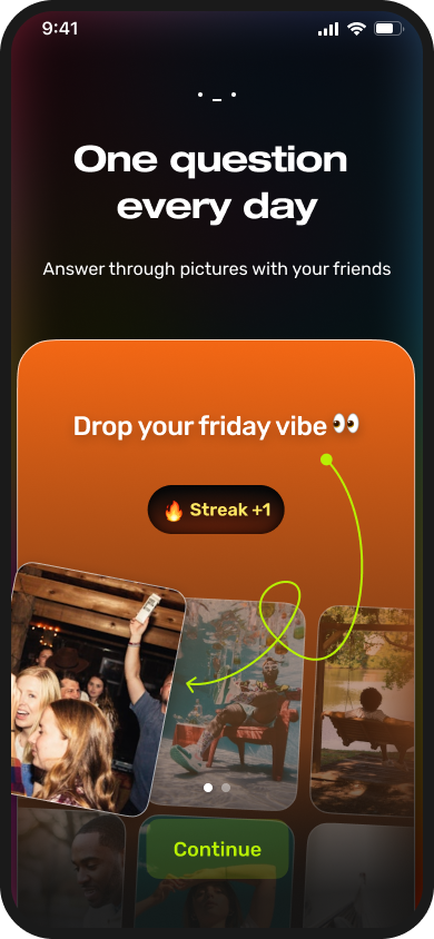
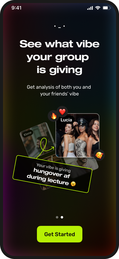
I compared text, one-screen and two-screen introductions. Text was easy to skip; one screen crowded the explanation. Two visual screens separated the daily photo action from the group’s shared vibe, while keeping the product’s mood.
Make the first action recognizable.
The early directions left Vibee’s identity unclear: photo app, social network or game. I explored how the daily question, photos and visual rhythm could explain what people would do together. The montage preserves those directions.
Let one message lead into the next.
The first screen introduces answering a daily question with photos. The second shows the group’s shared vibe. I connected them with a transition so the action leads into its result. Both appear before phone verification.
Give each explanation its own space.
The two screens give the daily photo question and the group’s response separate space. Photos carry the example while short copy names the action. Seeing both together makes the relationship clear without crowding one screen.
Make arrival perceptible
Mark the start before asking people to act.
I proposed and created a three-second splash to bridge the abrupt start. It leads into the introduction and then authentication. The opening gives the experience a visible beginning; the smaller interactions carry feedback through the steps that follow.
Compare how the next screen arrives.
The three explorations use a logo fade, a rising interface and a center split. Each emphasizes a different part of arrival: the identity, movement into the screen, or an opening onto the experience. These demonstrations reconstruct the original directions.
Use motion where a change needs a response.
The splash marks entry; transitions connect screens; microinteractions respond to an action. I designed these together with the UI so people could follow the sequence. Their timing needs to leave room for reading and moving on.
What changed
A different first visit, with room to look around.
The finished flow introduces Vibee and opens the group before photo sharing. I experienced an improvement after the redesign. That is an experiential assessment; comparable measurements are not currently available.
Connect what changed to what can be observed.
The design changes are visible: an introduction before verification, optional photos after browsing, and feedback between steps. Making the photo optional separates access from contribution. Evaluating the result means following both group entry and voluntary participation.
What I took forward
Place the request where people can decide.
This work connected the order of requests with what people could see and understand. I proposed the sequence and made the screens and motion that carry it. A next check would follow what happens after browsing: whether people choose to share and reach a first activity.
What I made, what I would check next.
My contribution spans the onboarding sequence, splash, interactive motion and microinteractions. The screens and recordings show the work. I saw the experience improve; the next step is to connect that observation to specific actions and a consistent way to assess them.
About
About the designer
I'm Jongmin, a product designer exploring design engineering. I care about how things work, and how they feel.
I think through the whole experience: what someone needs, how they get there, and the details that make it feel right.
Product design is my starting point. I'm exploring design engineering to bring more of those ideas into working interactions.
Contact
Something on your mind?
A role, a project, or just a hello. I'd like to hear it.